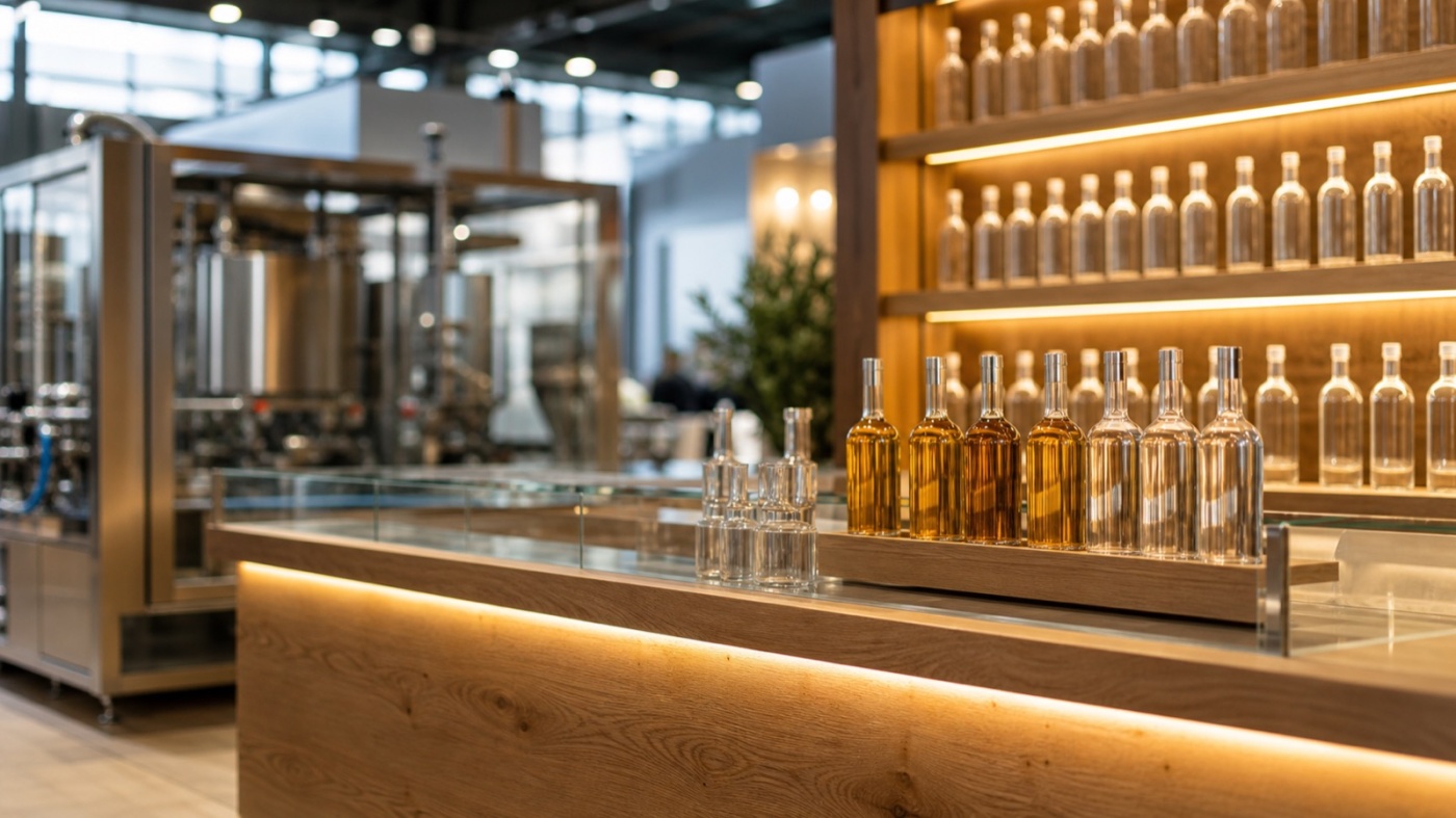
Around 1,100 exhibitors in eleven halls, roughly 70 per cent of them from outside Germany: every four years drinktec brings the entire beverage and liquid food industry to Munich. Two very different worlds meet on the stands, polished process technology on one side and the sensory world of the finished drink on the other. Lighting and surfaces decide whether the two come together.
Two worlds under one hall roof
drinktec last took place from 15 to 19 September 2025 at the Messe München grounds, and the calendar lists 2029 as the coming edition, usually in September as well. The show covers the complete value chain: raw materials and ingredients, process technology for soft drinks, alcoholic beverages, dairy products and liquid food, filling and packaging technology including the PET cycle, and finally marketing and design solutions.
This is where the double design brief comes from. One hall holds a filling line in polished stainless steel, a few metres further on a brand presents its new recipe in the bottle. Many exhibitors show both on the same floor space: technology on one side, result on the other.
The Munich halls are column free and tall. Ambient light sits high above the stands and spreads evenly, which leaves an unlit floor space looking flat. Your lighting design brings attention back to eye level.
The focus topics of the last edition were circularity and resource management, data2value, and lifestyle and health. The first of these touches material choice and stand construction directly.
Light that travels through the drink
Beverages are translucent, and that is their design strength. Amber in beer, ruby in juice, clear depth in a spirit: transmitted light is what makes those colours visible. A backlit shelf with even luminance turns a row of bottles into a light object, whereas a spot from above mainly highlights the closure.
Glass also lives on its edges. Grazing light at a shallow angle traces grooves, embossing and label borders and gives the bottle contour. Two directions together, soft backlight from behind and a narrow accent from the front, create the image visitors photograph later.
Cans follow a different logic. Aluminium returns light instead of transmitting it, so the size of the source counts. One large soft luminous surface mirrors as a calm gradient across the body, while many small spots scatter restless dots. For the print on the can, that difference decides the effect.
Guiding reflections on purpose
Polished stainless steel mirrors the entire hall, neighbouring stand and ceiling rig included. Plan with that quality rather than against it. Large diffuse luminous surfaces create calm reflections that make a machine look valuable, while a row of point sources produces a pattern of dots that pulls the eye away from the technology.
Eye level deserves a second look as well. Luminaires with glare control and beam angles aimed at working surfaces rather than faces keep staff and visitors comfortable across five show days.
Control panels show their surface at their best when bright sources are turned out of the mirror axis. A slightly tilted screen and one accent from the side keep the interface legible and let the demonstration speak for itself.
Colour rendering and zones: warm at the counter, neutral at the line
Beverage colours and label colours are brand assets, so high colour rendering belongs to the basic requirements. Lamps with weak rendering leave reds dull and yellows grey, and those are exactly the tones your packaging relies on.
Zoning by task has proven itself. Neutral white light works above the process technology, because it keeps steel clean and lettering legible. Above the tasting counter, lounge and seating group the colour temperature moves towards warm, because drinks and faces gain from it. A soft transition between both zones, for example through a shared indirect base level, holds the stand together as one design.
Dimmable circuits add the course of the day. Bright and crisp in the morning, softer and warmer for the evening reception: the same space then tells two stories.
Materials that echo the ingredients and handle moisture
On drinktec the tasting counter is the heart of the stand, and it is a wet area at the same time. Low joint surfaces in solid mineral material or stainless steel, sealed edges, slip resistant flooring and a thought through route for ice, glassware and empties keep this area presentable across five days.
Around that function the material may tell a story. Oak picks up the cask, ceramic and natural stone stand for water and minerality, malt, hop cones or coffee beans behind glass connect the drink to its origin. Brushed aluminium and glass in turn speak the language of the technology and bridge across to the machinery side of your stand.
The circularity focus favours surfaces that show their origin: panels made from recycled PET, recycled aluminium, returnable glass used as a design element. Choices like these land as soon as you can evidence them, for instance with material data sheets on the stand. How reuse is built into the construction from the start is described on our page about sustainable exhibition stands.
One note on heat: LED fixtures placed close above the serving surface warm glasses and drinks. A little distance and good ventilation inside the counter body keep the temperature where it belongs.
What the visitor ends up holding
Much of drinktec is decided in the moment a filled glass stands in front of someone. Light that carries the colour of the drink, and surfaces that make origin and quality tangible, stretch that moment into a conversation.
A four year interval argues for planning luminaires, frames and furniture as an asset that goes into storage, gets checked and is re-covered for the next appearance. For individual elements, the option to rent an exhibition stand is the calmer route. If you are preparing your appearance in Munich, we are glad to talk through floor space, lighting concept and material collection: request an exhibition stand.