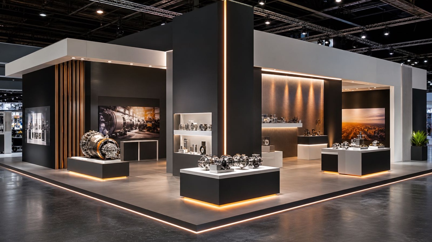
People who walk past a well-lit exhibition stand often stop without quite knowing why. The eye follows the light. An exhibit that is cleanly illuminated looks more valuable, a graphic becomes legible, and a counter invites conversation. That is exactly why lighting at the exhibition stand is not a side issue but a tool that helps decide whether your products get attention. This article covers how general and accent light work together, what role the colour of the light plays, how to illuminate products and graphics, and what to keep in mind when planning your power supply.
General Light and Accent Light: Two Jobs, One System
Lighting on an exhibition stand serves two different purposes that you should keep mentally separate. The general light, also called ambient light, provides an even base brightness across the whole stand. It makes walkways, seating areas and general orientation comfortable and stops corners from looking dark and unwelcoming. The general light is the stage on which everything else takes place.
Accent light, by contrast, sets deliberate focal points. It highlights individual products, a brand mark or a material sample and creates brightness differences that guide the eye. What matters is the contrast between the two layers. If the entire stand is lit to the same brightness there is no hierarchy, and the eye finds nothing to hold onto. Only when an exhibit is noticeably brighter than its surroundings is it perceived as important. As a rough guide, an accent should be clearly brighter than the general light so the difference stays visible even under the hall's strong ambient light.
Colour of Light and Its Effect: Why Kelvin Matters
Light has a colour, and that colour changes the perception of a product considerably. It is measured as colour temperature in the unit Kelvin (K), a scale that runs from warm through neutral to cool. Low values mean warm, yellowish light, high values mean cool, bluish light.
Warm white light of around 2700 to 3000 Kelvin creates an inviting, homely mood. It suits wood, textiles, food and anything meant to feel cosy and high quality. Neutral white light around 4000 Kelvin looks factual and clear and fits working areas, technical products and situations in which colours should appear as natural as possible. Daylight white light from about 5000 to 6500 Kelvin looks cool and fresh and emphasises technical or medical products, but it can quickly feel sterile. There is no fixed rule, but a well-considered stand rarely mixes colour temperatures at random, because that looks restless and distorts materials.
Beyond colour temperature it is worth looking at the colour rendering index, or CRI. On a scale up to 100 it describes how naturally a light source shows colours. For products where colour matters, such as textiles, paints or packaging, a high CRI is recommended so that the shade on the stand matches the real product.
Illuminating Products and Graphics Correctly
When illuminating products, the direction and the amount of light are what count. A spotlight that catches an exhibit slightly from the side and above creates shadows that make form and structure visible. Frontal light, by contrast, looks flat and robs objects of their depth. The amount of light falling on a surface is measured in lux, while the overall brightness of a lamp is given in lumens, meaning the total light it emits. For individual exhibits you work with narrower beam angles, for larger areas with wider ones.
Graphics and lettered walls need even illumination without bright spots and dark edges. Nothing looks less professional than a logo whose upper half shines brightly while its lower half disappears into half-darkness. Backlit surfaces, where the light sits evenly behind a fabric skin, solve this especially elegantly and produce a calm, even glow. With glossy materials such as glass, polished metal or lacquered surfaces you also need to watch for reflections, so the light shows the product and not a mirror image of the lamp.
Just as important as the illumination itself is avoiding glare. Good light is not seen directly, you only see its effect. As soon as a light source dazzles a visitor the effect flips into its opposite, and the stand feels unpleasant. Glare usually comes from very bright bulbs left visible in the field of view or from reflections on glossy surfaces. A few principles help avoid it:
- Position or shield bulbs so that visitors do not look straight into the light source
- Angle spotlights slightly so they hit the exhibit and not the eyes of visitors
- Plan for reflections on monitors and display cases and offset light sources accordingly
- Dose contrasts deliberately, so the transition from bright to dark does not become painfully harsh
LED Technology: Efficient, Cool and Flexible
Today's exhibition lighting is based almost entirely on LED technology, and for good reason. LED fixtures use considerably less power than earlier halogen or metal-halide lamps and give off far less heat. On cramped stands that is a noticeable advantage, because the air does not heat up as much and products do not suffer under hot spotlights. LED systems are also compact, which allows delicate constructions and slim light strips.
Another advantage is flexibility. Many LED systems are dimmable, and some can be adjusted in colour temperature, so the same light can be adapted to different situations. This efficiency feeds directly into power planning, because lower consumption means a lower connected load, as the next section shows.
Connected Loads and Power Planning
As important as the design side is, without proper power planning the finest lighting concept stays theory. Every fixture has a connected load, measured in watts (W), which states how much electrical power it needs. Add up all fixtures, monitors, appliances and the stand kitchen, and you arrive at the total power demand. On this basis you order the right power connection from the organiser.
This connection costs money and has to be registered within the deadlines of the particular trade fair. The specific values, deadlines and requirements are set out in the technical guidelines of the exhibition company and differ from fair to fair, so they should always be checked for the specific event. It is important not to order the connection too small or unnecessarily large. If it is too small, in the worst case a fuse blows during the fair; if it is clearly too large, you pay for capacity you do not use. The power connection, by the way, is one of the additional costs the exhibitor pays directly to the organiser, separate from the actual stand construction. How planning steps like these fit into the overall process is something you can read in the timeline for your trade fair appearance.
Thinking Light, Stand Colours and Materials Together
Lighting never works on its own, but always in interplay with the colours and materials of the stand. Bright, matt surfaces reflect light diffusely and make a stand look open and friendly. Dark surfaces swallow light and need more power for the same effect, but in return they make illuminated exhibits stand out all the more. Glossy materials mirror and call for well-considered light guidance so that reflections stay under control.
The colour of the light should also match the brand world. A warm light on a stand kept in cool blue tones can distort the carefully chosen colours. That is why stand design, material choice and lighting concept belong together from the start and are best planned jointly. How colours, materials and lighting combine into a coherent appearance is shown on the page about exhibition stand design. How differently lighting moods work by sector can be seen at specific trade fairs, for example the exhibition stand for Light + Building, where light itself is the theme, or the exhibition stand for Heimtextil, where warm light brings textiles and colours to life.
Conclusion
Lighting at the exhibition stand is more than brightness. The interplay of calm general light and targeted accent light, a deliberately chosen colour temperature, glare-free and even illumination and solid power planning together decide how your products are perceived. Anyone who links the lighting concept with stand design and materials early on saves effort and achieves a much stronger effect. If you would like to discuss the lighting concept for your next trade fair appearance, you can reach the trendSETZEREI on +49 69 201 65 001 or by email at info@dietrendsetzerei.de.