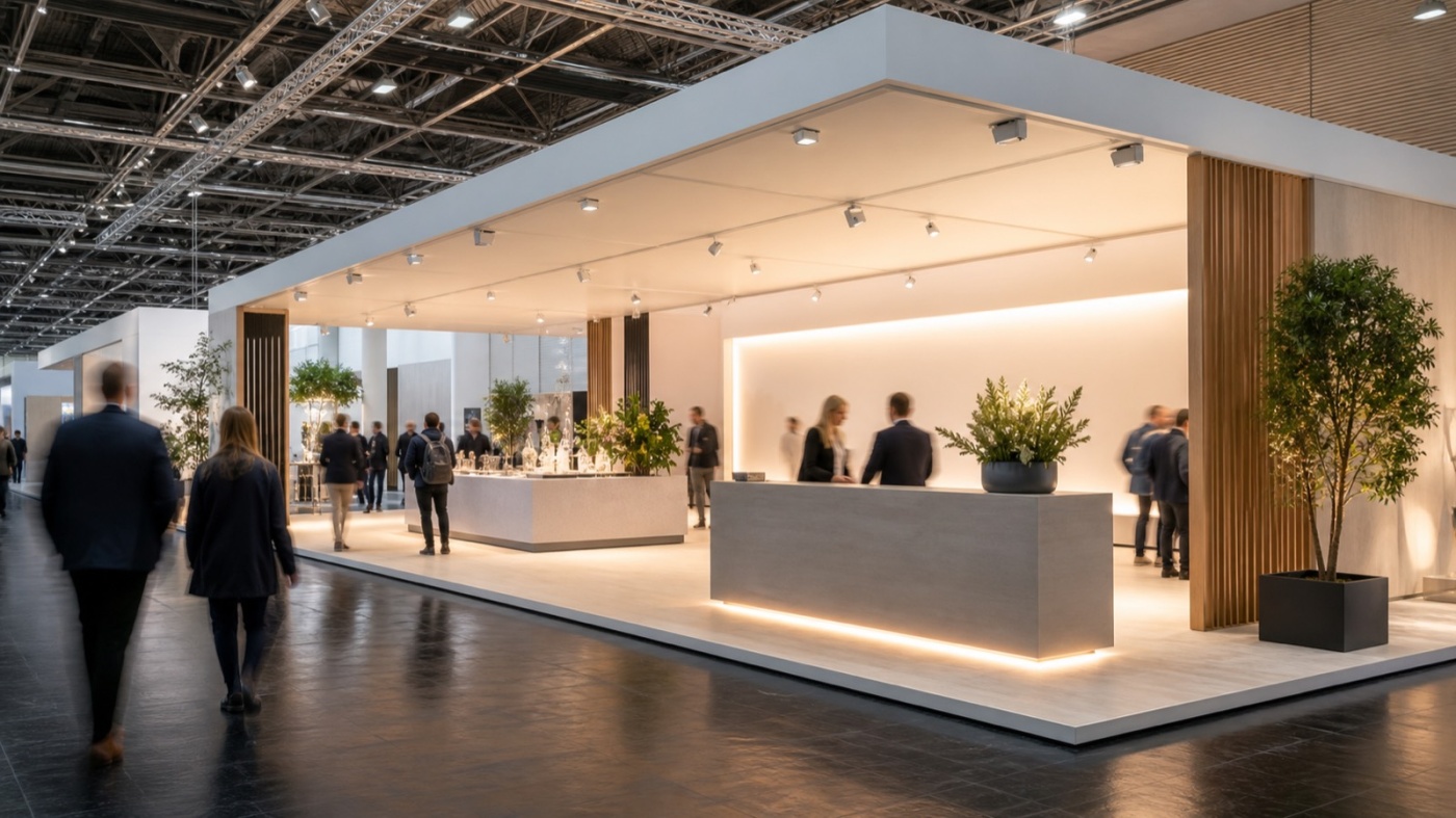
Only a few metres separate the aisle edge from your back wall. Those metres decide whether a visitor walks on or slows down. Read your floor plan as direction rather than as square metres, and you gain conversations that would otherwise pass by.
The first metres: where visitors step in
Visitors make their choice while walking, and they make it fast. They catch the edge of your stand out of the corner of an eye and look for a reason to slow down. Visitor flow starts right there, at the entry point.
An entry point appears wherever the stand edge releases space: an open corner, a furniture-free area facing the aisle, a change of flooring that makes the threshold visible. Keep the first one to two metres deliberately clear. That zone belongs to the visitor, so they can step in before anyone speaks to them.
The counter deserves particular attention. Placed hard against the aisle it reads as a barrier. Set back by a step or two, the very same counter becomes a point of orientation. Exhibits behave in a similar way: at the edge they attract glances, a few steps further in they attract people.
Your stand team is part of the layout as well. A group standing in the middle of the open area closes it visually. Positions to the side of the entry zone keep the path clear and still allow an early, friendly welcome.
Three zones every stand needs
Floor space turns into guidance once it is given jobs. A structure with three public zones plus one internal area has proven itself across stand sizes.
The welcome zone sits at the aisle and answers within seconds who you are and what you offer. It stays open, bright and clear enough for two people to walk in side by side.
The presentation zone follows behind it. Exhibits, samples, screens and live demos live here. This zone thrives on eye contact with the product and on room to walk around it.
The conversation zone sits furthest from the aisle, often against a wall or behind a half-height screen. Anyone who sits down here has already decided to invest time. Seating, calmer acoustics and a surface for documents pay off accordingly. Consent for follow-up contact is far easier to record properly in that calm than in a crowd, so plan how consent-based lead capture fits into the flow while the layout is still on paper.
Finally there is the internal area: storage, coats, coffee, charging points. It disappears behind the back wall and keeps the public zones tidy.
Sight lines: what reads from twenty metres
From a distance a visitor takes in three things: the brand, the category and a reason to come closer. Everything else lands only at short range.
Height therefore works in your favour. A logo, a gantry, a flag or a backlit surface above head height stays visible even when the aisle is busy. How high you may build is governed by the technical regulations of each show, including height zones and restricted zones. Reading the current edition early creates clarity, because the values differ by organiser and by hall.
Depth comes from layering. A closed back wall across the full width reads flat. Two or three layers behind one another, for example an open front, a central presentation island and a luminous rear wall, create spatial pull and draw the eye inwards. Lighting reinforces the effect as soon as the rear layer sits brighter than the front one.
Test sight lines on the plan in a very literal way: place yourself mentally at every aisle access and ask what remains visible from there. A 3D visualisation lets you run through this in minutes, long before material is ordered. Our reference projects show how differently these axes work out depending on stand form.
Paths, widths and the quiet role of furniture
Inside the stand, furniture guides more reliably than any sign. A seating group, a plinth or a display case act as soft barriers and shape the route without anyone pointing it out.
Plan circulation wide enough for two people with bags to pass each other comfortably. As soon as it tightens, visitors step aside, usually back onto the aisle. A loop helps as well: whoever walks in finds a way out again while moving forward. Dead ends cost dwell time.
Retail practice suggests that people in open spaces tend to orient to the right. Whether that holds on your show floor becomes clear on day one. The observation is worth making, because it decides where your most important exhibit belongs.
Keep eye level in mind too. Anything a visitor should grasp while walking belongs between chest and eye height. Surfaces near the floor reach them once they are already standing still.
Sharpen it on day one
A layout proves itself in operation. Take twenty minutes on the first show day, stand diagonally opposite and watch: where do visitors slow down, where do they turn back, which exhibit attracts glances and which one attracts glances plus footsteps?
Most corrections are small. A poseur table moves a metre, an exhibit turns ninety degrees towards the aisle, a banner leaves the sight line. Record the results with photographs. Planning for the next show then starts from real observation rather than a blank page.
Thinking about entry points, zones and sight lines early wins back area that would otherwise serve as pure circulation space. If you would like to talk through the layout for your next appearance, send us your floor plan. A simple sketch already answers a surprising number of questions.