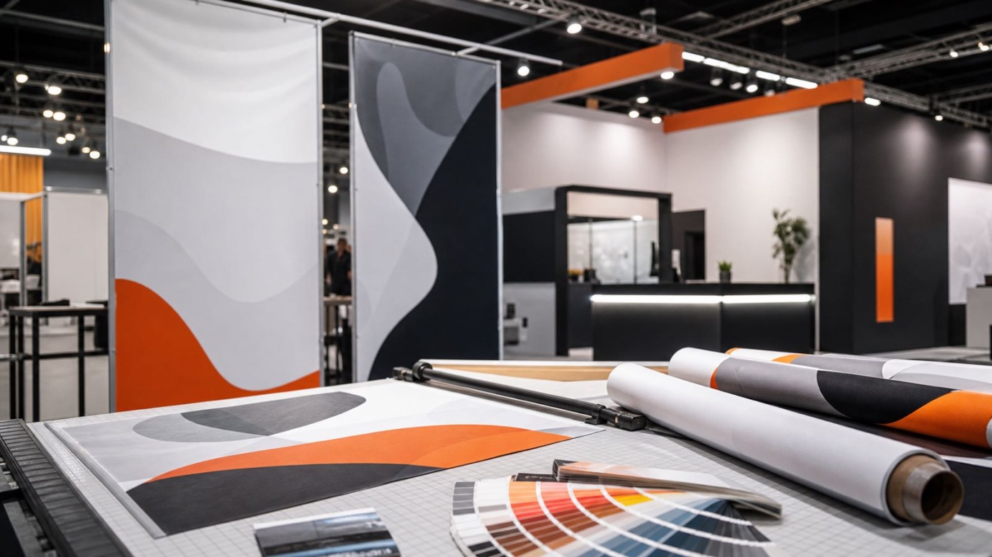
Once the stand is planned and the design is settled, one step decides how the whole thing reads on the show floor: the production of the large-format graphics. Many exhibitors underestimate how much of the final quality depends on the data they hand over. So what data does the stand builder actually need to make sure your exhibition stand graphics end up sharp, colour-accurate and ready on time? This article explains the key criteria around file formats, colour spaces, resolution and materials, as well as deadlines and approval.
File formats and colour space
Print data for exhibition construction is prepared differently from graphics meant for a screen. The most important difference concerns the colour space. Monitors display colours in the RGB model (red, green, blue), while printing works in the CMYK model. CMYK stands for the four print inks cyan, magenta, yellow and black (key). If RGB data goes to print unchecked, strong blues, greens and oranges in particular shift visibly. For that reason, set up your files in CMYK where possible, or agree the colour space with the stand builder in advance. For binding brand and corporate colours, spot colour values from a common colour reference system are helpful as an addition.
When it comes to file types, a distinction is drawn between pixel data and vector data. Pixel data (for example from photo or image editing) is made up of individual dots and loses sharpness when enlarged. Vector data, by contrast, describes shapes through mathematical curves and can be scaled to any size without becoming blurred. Logos, lettering and solid shapes should therefore be supplied as vector data. As an exchange format for production, PDF/X has become the standard. It is a print-standardised PDF variant in which fonts are embedded, colours are defined and the bleed is set up cleanly. A file like this is more self-contained and less error-prone than an open working document.
Resolution and viewing distance
A common assumption is that large graphics need especially high resolutions. In exhibition construction the opposite is actually true: the further away the viewer stands, the fewer dots per inch (dpi) are needed. Resolution is always calculated in relation to the final size and the typical viewing distance.
A small graphic on a counter, read from close up, calls for a high resolution. A back wall several metres wide, taken in from a few metres away, gets by with far fewer dots, because at that distance the eye no longer resolves the individual points anyway. What matters is the effective resolution at the finished size, not the raw pixel count of the source file. An image that looks flawless at a small size can be too coarse for a large wall. So always tell the stand builder the intended final size, so they can check the right resolution and data quality. Be careful with small images pulled from the internet or from presentations: they cannot be rescued by upscaling after the fact, because that process does not create any real image detail. For large surfaces, high-resolution original files or vector data are the safe foundation.
Bleed and safety margins
So that no unprinted white edges appear at the borders of a printed surface, the graphic is set up beyond the later final format. This overhang is called bleed. It gives the finishing process some tolerance when material is trimmed, made up or drawn into a frame.
Just as important is the safety margin towards the inside. Important content such as the logo, text and image motifs should not sit right at the edge, but keep a distance from the border. That way, small production tolerances do not cost you any content, and with textile coverings nothing disappears into the edge or the keder, the plastic bead used to tension the fabric into the frame. How much bleed and safety margin are actually needed depends on the material and the finishing method. You should ask for these values before creating the data, because they differ depending on the construction.
Materials and their requirements
The choice of material influences how the data is prepared and how colours end up looking. Common options in exhibition construction include:
- Textile covering in a tension frame: printed fabric tensioned into an aluminium frame without creases. Light to transport, reusable and glare-free, with a soft colour rendering.
- Vinyl film: self-adhesive print for smooth surfaces, furniture or floors, available in matt or gloss finishes.
- Rigid boards: solid substrate materials for walls, counters and displays that produce a flat, stable surface.
- Backlit graphics: a translucent motif in front of a light box or an LED surface. Graphics like these need their own data setup, because the light shining through changes colours and contrast.
With backlit motifs and textile surfaces in particular, early coordination pays off, because the same motif looks different depending on the material. Which combination suits your stand concept is best settled together with the stand design, so that design and production are aligned with each other.
Deadlines and approval
Printing and finishing need lead time. Large-format printing, trimming, the sewing of textiles and the mounting into frames are production steps that cannot be sped up at will. How much time is needed in a specific case depends on scope, material and workload, and should be agreed early with the stand builder. During the peak season around the big Frankfurt trade fairs, lead times tend to be longer. So do not plan the data handover as the last item before the build, but as a fixed milestone in the overall schedule. How production fits into the rest of the planning is shown in the overview on planning your trade fair appearance.
Before production comes approval. The usual step is a proof, a binding sample that represents the later output. This can be a colour-accurate print that anticipates the print inks as closely as possible, or a digital approval version that shows content, arrangement and dimensions. When you review it, check the text for typos, the completeness of all content, the placement and the colour effect. Only once you approve the proof does the file go into production. This step costs a little time, but it prevents expensive reprints when, for example, a colour is off or a motif gets cropped. How tightly approval and the show date are timed becomes clear in specific fair examples, such as a stand for Heimtextil in Frankfurt or a stand for FIBO in Cologne.
Conclusion
Good print results at the exhibition stand do not begin in the machine, but in the data setup. Vector data for logos and type, the right colour space in CMYK, a resolution that matches the viewing distance, correct bleed and a proof approved in good time are the foundations for a clean result. Which formats, materials and deadlines make sense for your specific appearance is best clarified early in the project. If you are preparing your graphics or have questions about the data handover, you can reach die trendSETZEREI GmbH by phone on +49 69 201 65 001 or by email at info@dietrendsetzerei.de.