A brand guide describes your company on paper and on screen. An exhibition stand adds three dimensions that the guide rarely covers: surface area, light and viewing distance. Design for those three, and visitors recognise you from the aisle long before any wordmark becomes legible.
What carries over from the brand guide, and what is new
Most corporate identities are built for two-dimensional media: website, advertisement, brochure, presentation. There, size, viewing angle and lighting are predictable. In a physical space, all three shift.
A visitor approaches from the side, first sees your back wall at an angle from twelve metres away, then stands two metres in front of the same surface. Hall floodlights, stand lighting and the neighbour's illuminated wall all mix together. And a logo that measures a few centimetres on a letterhead becomes a surface of several square metres.
Colour values, typeface, imagery and formal language all transfer. Proportions, contrast levels and materials are created afresh. That is why it pays to extend the brand manual with a short chapter for physical space: binding colour references for paint and textile, minimum sizes for large format, a signage grid and approved surface finishes. That chapter saves rounds of clarification in every future tender.
Colour works as surface, the logo works as signature
The most common weakness in stand design is logo overload: the mark on every fascia, every counter, every stool, every cushion. Recognition rarely follows from repetition, because it is carried by colour, form and light, all of which register faster than any word.
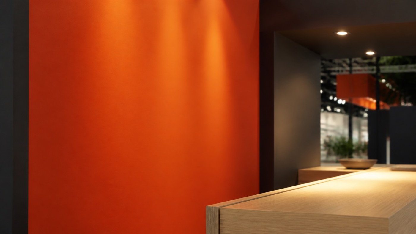
Work with large, calm colour fields instead. One dominant surface carries the appearance, a second colour organises zones, and the accent colour stays reserved for the elements that deserve attention: the exhibit, the reception, the one sentence you want people to remember. The logo then appears large and in a few well chosen places, such as the fascia facing the main aisle and the wall behind reception.
Colour definition rewards care. Your brand colour exists as a HEX and RGB value for screens, as a CMYK build for print, as a Pantone reference and, for lacquered or powder-coated components, additionally as a RAL or special shade. The same colour lands slightly differently on printed textile, on vinyl, on lacquered timber and on carpet, because every material reflects light in its own way.
So budget for material samples and approve them under the lighting the stand will actually use. Colour temperature and colour rendering shift perception noticeably, warm light more than neutral white. Keep the surface effect in mind as well: a shade that feels friendly on a letterhead can dominate an entire room across twenty square metres of wall.
Type at large scale decides legibility
Corporate typefaces are optimised for running text, frequently for screen display on top of that. At large scale they behave differently: fine strokes read thinner, tight letter spacing closes up, and capitals gain weight.
Build a clear hierarchy with three levels. One statement reads from ten metres, meaning the company name and a short benefit line. A second level labels zones from around three metres. The third level, detail copy and technical data, belongs within arm's reach at the counter, the display case or the exhibit.
The most reliable test is a 1:1 sample print, viewed from the real distance in a real room. Screens flatter type consistently. Check the font licence early as well: web and desktop licences frequently stop short of large-format printing and permanent signage.
Materials and finishes carry the brand values
Materials communicate faster than copy. Raw timber, felt and warm tones speak of craft and proximity. Powder-coated metal, glass and precise joints speak of engineering and accuracy. Both routes are valid, as long as they match what you sell.
Three practical points carry particular weight:
Gloss level. Satin matt surfaces stay calm under spotlights, while high-gloss panels mirror lamps and neighbouring stands and pull attention away from the exhibit.
Touch. Trade fair visitors handle edges, counters and samples. A surface that feels substantial confirms the brand promise every few seconds.
Durability. A stand is in service on day three exactly as it was on day one. Protected edges, exchangeable fabric graphics and repairable components keep the picture clean. Printed textiles in a system build also deliver large, seamless colour fields that sheet materials achieve only with considerable effort. Our exhibition stand projects show what that looks like in practice.
Where the stand deliberately departs from the website
A screen emits its own light, a stand wall receives it. Pale greys and delicate contrasts that look elegant in a browser lose their force under hall lighting. Raise the contrast between type and background and work with wider brightness differences than you would online.
The order of perception changes too. Online, scrolling guides people through content. At a fair, the aisle guides them past your stand. Your message therefore needs a spatial dramaturgy: long-distance impact at the fascia, orientation at the zones, depth at the exhibit.
The goal is recognition rather than replication. Same colour family, same formal language, same imagery, combined with sizes, contrasts and materials that answer to the room. When a visitor opens your website that evening and instantly knows which stand they visited, the translation has worked. Our exhibition stand services describe how that path runs from brand manual to finished surface.
A brand you can walk into
Corporate design on an exhibition stand succeeds through a handful of consistent decisions: large colour fields instead of many small marks, a type hierarchy built for three viewing distances, materials that suit the brand and survive show conditions, and samples approved under real light.
The best moment for those decisions comes before the first sketch. Bring your brand manual, your colour references and a sense of the effect you want into the concept meeting, and the design works in your brand language from the outset. An informal enquiry is enough to get that conversation started.