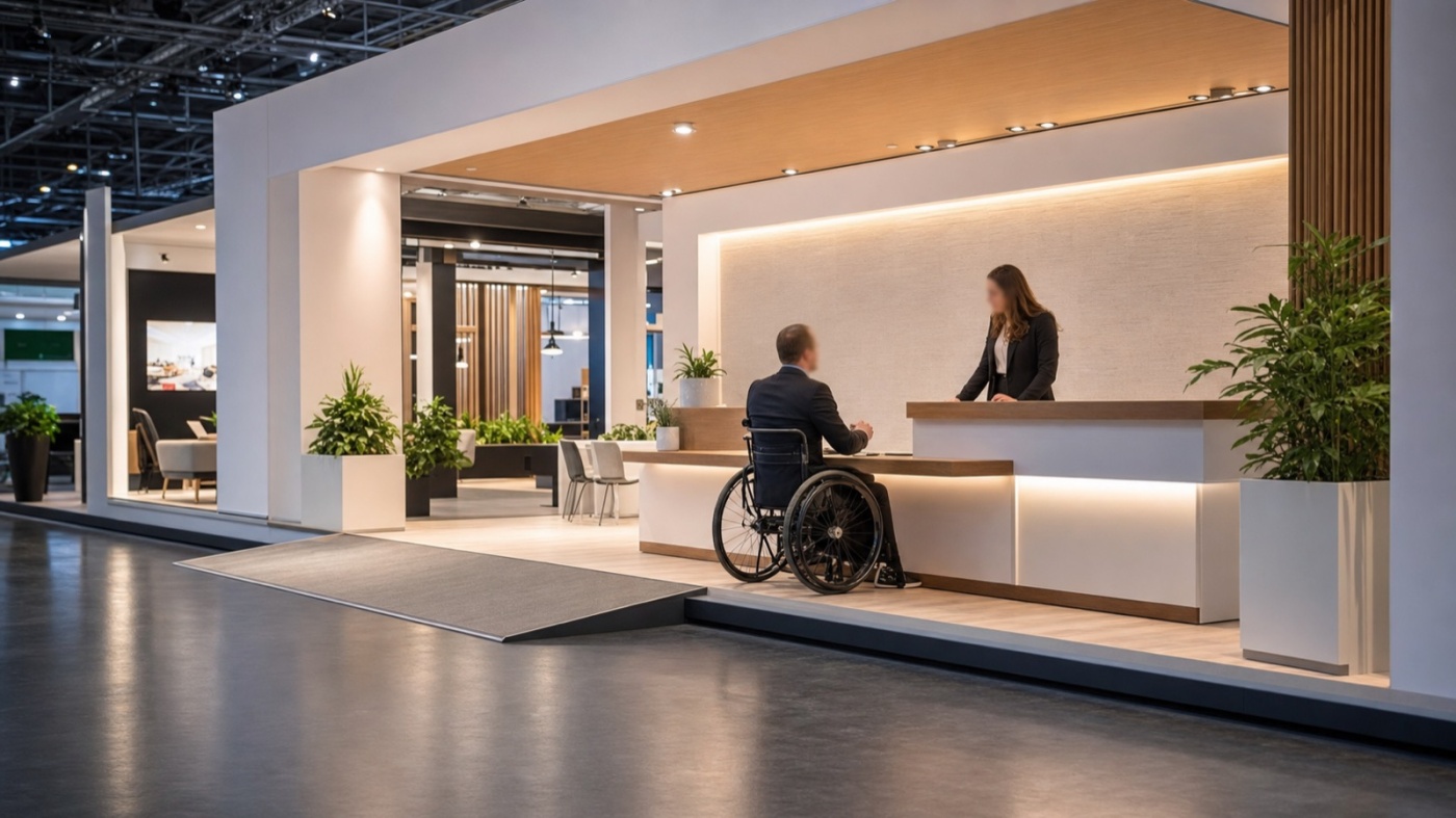
An exhibition stand is judged in seconds. If a visitor catches a wheel on an edge, has to speak upwards across a tall counter or can only guess at your headline, that visitor moves on. Accessibility is therefore a question of reach: it decides how much of the audience your offer actually meets.
The first metre: onto the stand without a step
Most stands use a raised platform floor. It hides cables, supply lines and drainage and looks premium, and it creates a step of anything between two centimetres and a hand's width. That is exactly where a ramp belongs in the plan, and it belongs there early, because a ramp takes floor space.
The German standard DIN 18040-1 for publicly accessible buildings serves as a useful reference. It applies to buildings rather than to temporary structures, where the technical regulations of the respective venue set the binding frame, yet its dimensions work well in practice: a gradient of up to six percent, a usable running width from 120 centimetres, level areas of 150 by 150 centimetres at both ends, and an intermediate landing once a single ramp run passes six metres.
Put that into the floor plan. At six percent, a ten centimetre step needs roughly 1.70 metres of ramp plus the turning area in front of it. On a 20 square metre row stand this becomes a deliberate design decision, often in favour of a ramp along the aisle edge.
Flooring matters just as much. A firmly bonded low pile carpet rolls cleanly, while deep pile slows wheelchairs and rollators noticeably. Keep cable ramps flat and bevelled, and mark transitions with a contrasting colour so people see them coming.
Heights that work for everyone
The counter is the most common obstacle in stand design, simply because it gets drawn at standing height. A second, lower level solves it elegantly: around 80 centimetres high, with clear knee space at least 90 centimetres wide and 55 centimetres deep. A wheelchair user then sits at the counter instead of in front of it, and the conversation happens at eye level.
For controls, DIN 18040 names an operating height of around 85 centimetres above finished floor level. Translated to a stand: mount touchscreens slightly tilted and low enough to reach, place brochures within comfortable reach rather than at chest height, and present exhibits so they stay visible from a seated position. Display cases with a tall solid base hide their content from a large part of the audience.
Think about visitors who simply need a break during a long fair day as well. Chairs with armrests and a seat height around 45 centimetres make standing up far easier than deep lounge furniture.
Circulation space is design, not lost area
A wheelchair turns within a field of 150 by 150 centimetres. Keep routes inside the stand at 120 centimetres or wider, and more generous wherever people pass each other. Leave a clear area in front of the counter, the shelving and the meeting table.
It sounds like a lot of space and it pays back twice: clear routes read as premium, they keep the stand flowing at peak times and they let your exhibits breathe. Escape routes and building restriction zones come from the venue anyway, so reading the technical regulations before the first sketch saves rebuilding later. Our overview of exhibition stand services shows how that planning runs step by step.
Seeing and reading: contrast beats size
Hall lighting is restless, spots create glare, and after four hours on the floor most eyes are tired. Contrast is therefore the strongest tool in your graphic concept. WCAG, originally written for digital content, offers a practical benchmark: 4.5 to 1 for body text and 3 to 1 for large type. For built environments, DIN 32975 describes luminance contrast in a similar direction.
Three decisions work immediately:
- Matt surfaces for graphic panels. Glossy laminates mirror the hall lighting and swallow any contrast advantage.
- Type on a calm background. A headline across a detailed photograph loses exactly the readers who need it most.
- Size by viewing distance. A common rule of thumb in wayfinding is around one centimetre of cap height per metre of distance, with back wall messages set considerably larger.
Code key information twice: colour together with a symbol and a word. Visitors who perceive red and green as similar still follow the logic of your stand. Glass panels and floor-level cases deserve markings at two heights so they stay visible in passing.
Hearing and understanding: sound, subtitles, a quiet corner
An exhibition hall sits at a permanently high background level, so subtitles in your brand film serve everyone, with or without a hearing impairment, because audio in the aisle disappears anyway. Set them generously, in a calm typeface and with clear contrast against the image.
Three additions prove their worth: a transcript or short text version next to the exhibit, a portable induction loop for hearing aid users in the meeting area, and an acoustically sheltered corner where conversations run calmly. Keep fast flashing effects out of your videos; WCAG draws the line at three flashes per second.
Build accessibility in early
Almost all of the effort sits in the design phase. Anyone who places ramp, counter level and circulation space in the very first floor plan pays little more than for a conventional stand. The same change made later on the hall floor becomes expensive.
There is a commercial effect too: public buyers and large corporates increasingly ask about accessibility in tenders. A stand that welcomes every visitor turns into an argument in procurement. You will find examples from completed builds in our project references, and for your specific floor area a short conversation about the layout clarifies more than any checklist.