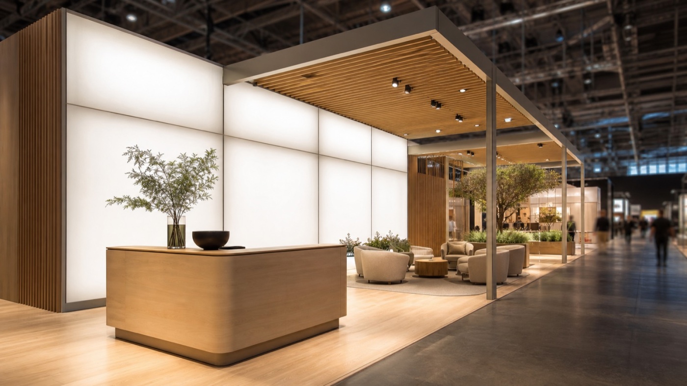
Booking floor space for 2027 settles a large part of the design brief, earlier than most exhibitors expect. Stand design is moving in one clear direction: more open space, materials shown as themselves, light treated as structure, and a brand that lands with a single statement from across the aisle. Five shifts will shape the coming season.
Material honesty: surfaces that show what they are
For years decor foil did the heavy lifting. A chipboard panel received a wood grain, a plinth borrowed the look of concrete. In the coming season the design language runs the other way: visible timber, raw or anodised aluminium, stretched fabric, matt glass and felt appear as themselves.
Taste is only part of the story. Material honesty works at close range, and close range is where the conversation happens: at the counter, beside the exhibit, in the seating area. A visitor who touches an edge and feels real material transfers that impression to the product behind it.
The second reason is practical. A component made from a single material can be separated cleanly, repaired and used again, while bonded build-ups with laminated foil usually end up as mixed waste. Our page on sustainable exhibition stands shows how that turns into a workable concept rather than a claim.
There is a welcome side effect for the look itself. Matt, genuine surfaces cope with restless hall lighting far better than high gloss, which mirrors every light source in sight.
Open floor plans: the stand opens to the aisle
The closed box with one entrance keeps losing ground. Current layouts work with zones rather than rooms: an open welcome situation along the aisle, a presentation zone behind it, and semi-open meeting islands with acoustic elements in place of sealed cabins.
The effect shows on any exhibition floor. A stand that visitors enter without a step and without the gesture of a door collects more first conversations. The back wall still carries the core message, because that is what people read first from the aisle.
Open plans ask for discipline in two places. Storage comes first: cases, brochure stock and coats deserve one compact, designed location. Venue rules come second. Building restriction zones, screening towards neighbouring stands and escape routes sit in the technical regulations of each organiser and belong in the brief before the first sketch.
Light as architecture rather than accessory
Lighting is moving to the front of the design process. Illuminated ceilings above the centre, backlit fabric frames as entire wall surfaces, LED tiles as a moving surface and slim light lines along edges now shape the space itself instead of merely highlighting products.
That changes the order of work. Floor plan and lighting concept develop together, because trusses, rigging points and supply lines shape the structure. Deciding early also means registering the power load with the organiser in good time, which keeps options open on site.
One practical note: large luminous surfaces photograph beautifully and dazzle quickly in conversation. A second, warmer and considerably lower light level above counter and seating keeps the stand comfortable.
Design for disassembly from the first sketch
Design for disassembly describes a structure that comes apart without damage. Tool-free aluminium frames, screwed rather than bonded joints, standard dimensions and graphics as a separately exchangeable layer all belong to it.
For exhibitors the arithmetic works over several years. The system core stays, graphics and furniture change per show, and the stand adapts to a different floor area instead of being rebuilt. Companies with one or two shows a year often combine this with a rented stand and keep the investment lean.
A further argument carries weight in corporate procurement: reuse can be documented. Reporting duties under CSRD call for solid figures, and a stand with a component list, storage location and usage history supplies exactly that basis.
Quiet brand presence: one statement, large and legible
The most striking shift is also the quietest. Instead of logo walls and a dozen claims, current stands carry one statement, set large enough to read from twenty metres. Colour field, material choice and proportion do the branding, and the logo confirms it.
The context explains the move. According to the AUMA exhibitor outlook for 2026 and 2027, a good quarter of respondents now justify their trade fair budget internally against digital channels. A stand whose subject registers in three seconds makes that case easier, because it attracts the visitors who match the offer.
In practice: one core message on the back wall, a second level at the counter, detail at the exhibit. Everything else belongs in the conversation.
Choosing the shifts that suit your floor area
Trends rarely work as a complete package. On twenty square metres of row stand the back wall decides almost everything, while on an island stand the floor plan and the lighting carry the appearance. AUMA reports that more than 40 percent of exhibitors plan larger trade fair budgets for 2026 and 2027, even as the share of the overall marketing budget slips slightly. Money is being directed at fewer appearances with more intent.
That is precisely why selection pays. Two or three of these shifts carried through fully read stronger than five half gestures. Which of them suit your floor area, your show and your budget becomes clear quickly in a short conversation about the layout.